
SavvySpender
Designed an app and website that reduces budgeting time by 78%, while increasing financial confidence from 20% to 80%.

Project type: Case Study
Role: Sole Designer
Tool: Figma
Deliverables: Mobile app and responsive website mockups
Duration: 4 weeks
The Problem
I have been on a journey to improve my financial literacy and money management systems. When looking for a budgeting app, I felt frustrated by how complicated and rigid many of the options I came across were. After speaking to people in my life and conducting some research, I realised many of us share this frustration.
The Goal
Design a money management app and responsive website that will let users learn how to budget and save their money. This will affect people who feel anxious, uncomfortable and triggered around money by providing a simple, dynamic and educational financial tool.
Critical User Journey
From anxiety to confidence: through a visual breakdown of pre- and post-design user journeys, I demonstrate how SavvySpender streamlines budgeting, improves task completion rates and increases user confidence.
Key Usability Metrics
Pre-Design
Post-Design
Budgeting Time
Pre-Design
Post-Design
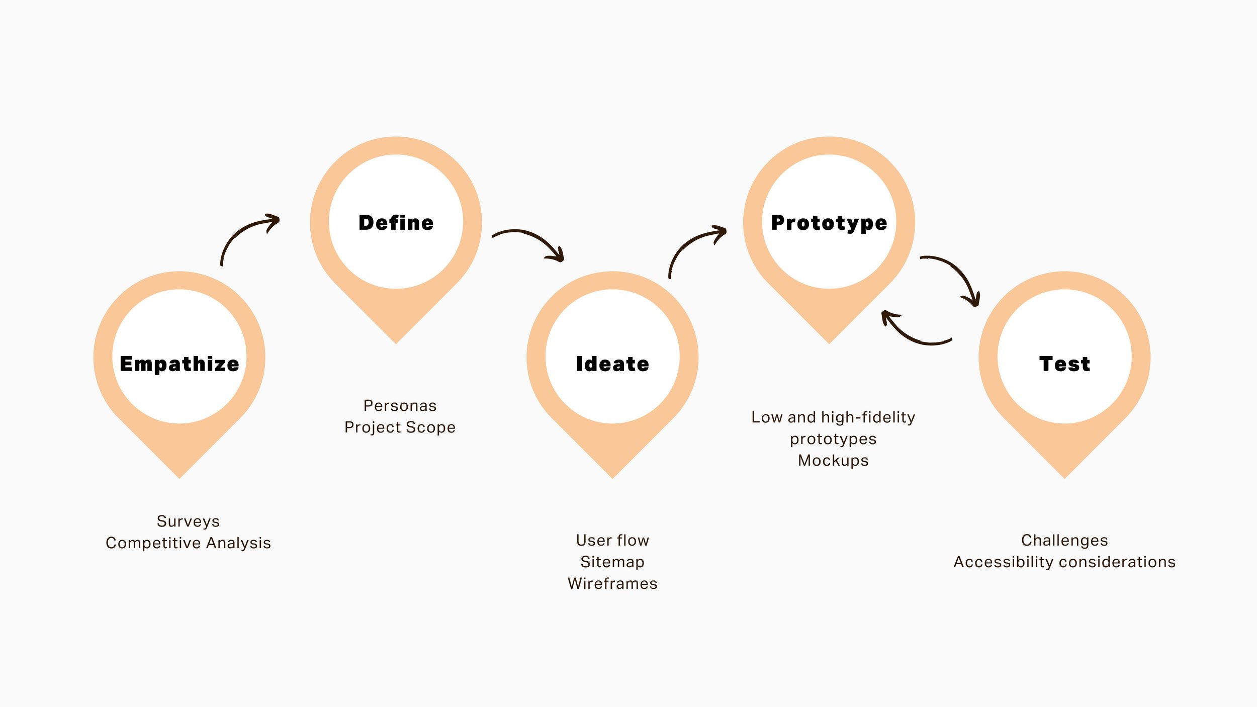
Process
I followed the design thinking process, using the Impact/Effort matrix to prioritise key features. By consulting with an engineer, I focused on high-impact elements that required minimal effort, ensuring an efficient and user-centered design.
User Research
I conducted a survey to better understand user behaviours, needs and motivations around money management. A total of 80 participants across Europe, North America and Africa completed the survey.

of participants expressed negative or ambivalent feelings towards the topic of money, often using the words ‘anxious’ and ‘uncomfortable.’
Time Commitment
The time investment to set up a budget can be discouraging for users, especially first time budgeters.
Accessibility
Budgeting tools often assume users have a fixed income. Users with varying income have expressed these tools don’t meet their needs.
Financial
Users who often need sound financial advice and tools can’t afford premium features and financial advisors.
Usability
The rigidity of many budgeting tools makes them hard to use consistently.
Competitive Analysis
I compared the user experience of three direct competitors, focusing on their apps and/or websites.

Impact/Effort Insights
As I started ideating potential features and solutions, I wanted to ensure that my design would deliver real value to users. I consulted an engineer and used the Impact/Effort matrix to evaluate which features to prioritise.

I identified high impact, low effort features to prioritise
Simplified onboarding and clear navigation.
Spending indicator bar for users to track spending visually.
Large, minimal buttons for intuitive interaction.
Educational “Learn” tab to improve financial literacy.
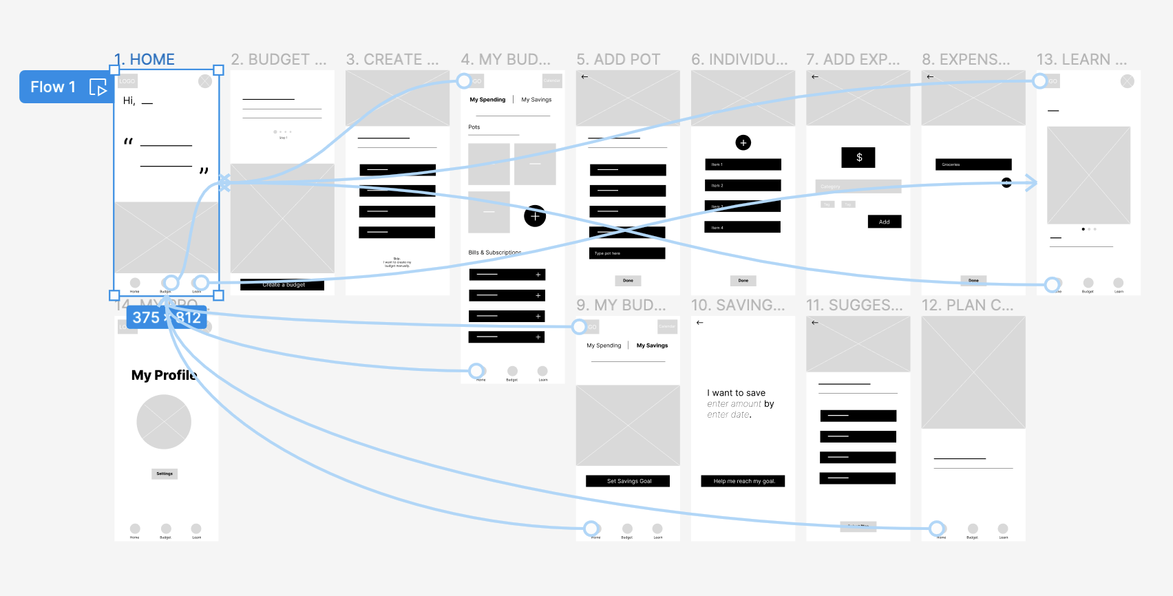
User Flow
I defined my app structure based on the pain points, goals and impact/effort insights from my research. The most important thing was to simplified, educational exeprience by establishing a user’s initial comfort levels with budgeting and money management from the outset.

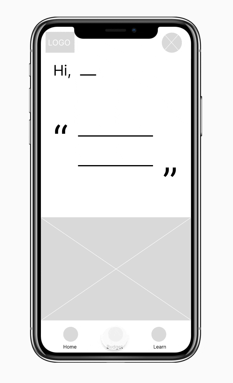
Paper Wireframes

Low-fidelity Wireframes
As I moved from paper to digital wireframes, I continued to centre the users’ pain points in my design.

Low-fidelity Prototype
Incorporating insights from my foundational research and peer feedback, I created a low-fidelity prototype.
High-fidelity Wireframes
After conducting a usability study with potential users, I incorporated feedback to improve my designs.
Budget Screen

Before usability study

After Usability study
Selected Spending Pot Screen
Before usability study
After usability study

Home

Add Expense

Savings Plans

Resources Library
High-fidelity Prototype
My high-fidelity prototype followed the same user flow as my lo-fi prototype.
I incorporated the feedback I received to enhance the user experience.


Responsive Website
Following the same design thinking process I used for the app, I designed SavvySpender’s responsive website for desktop and mobile.


Impact
The SavvySpender experience transformed user budgeting:
22% increase in task completion rates, making budgeting easier and more intuitive.
78% reduction in time needed to create a budget.
30% decrease in budgeting errors, leading to more accurate financial planning.
Increased confidence in managing personal finances.